

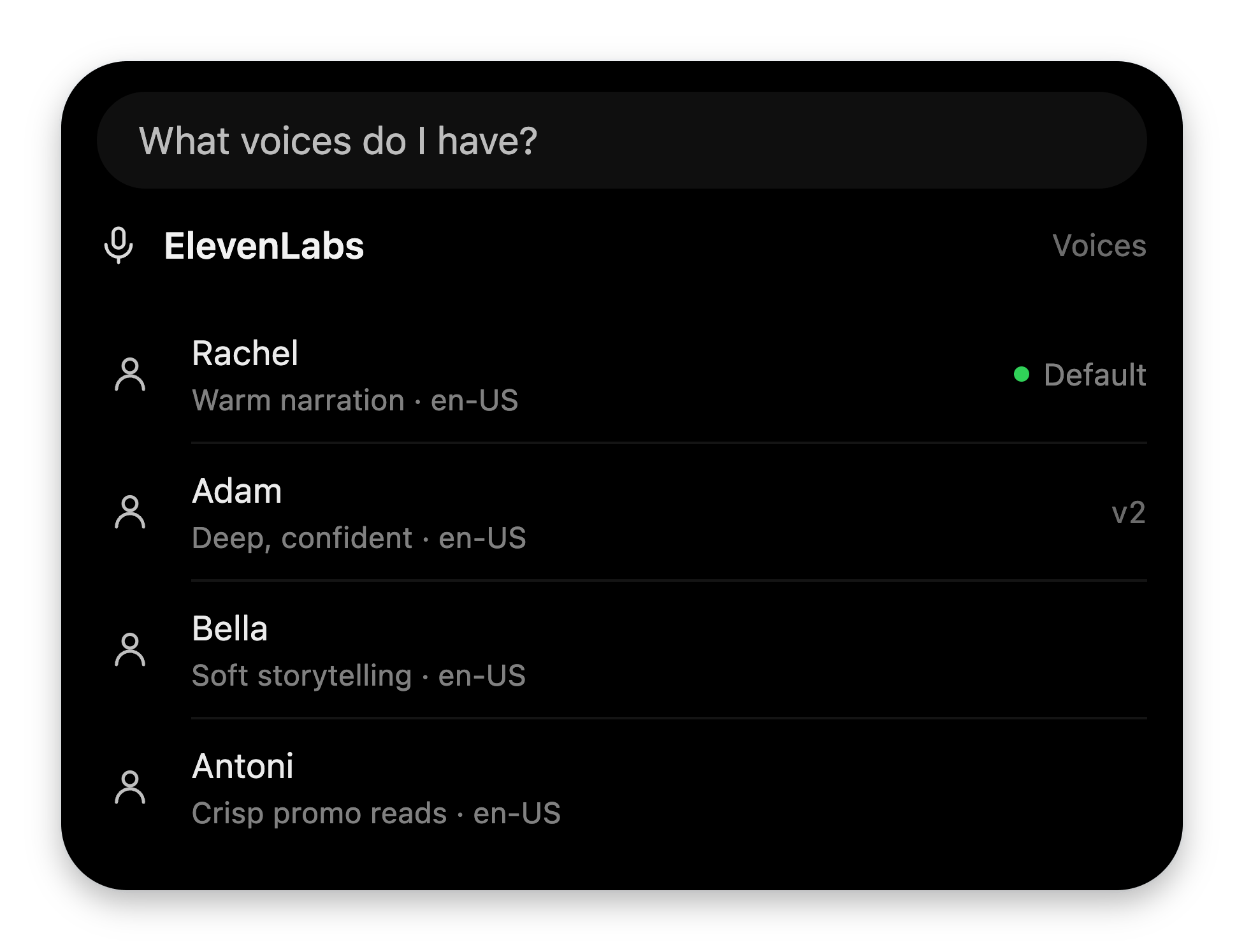
Design target: a two-second read. Not a dashboard — the one thing the user wants to see.
Attaching a card
SpreadglanceResult([...]) into your tool’s JSON result:
_voiceos_glance: { blocks } key to your payload. VoiceOS lifts it
out before the model sees the result — the model reads your data, never your
UI JSON.
Background completion
Background tools return the same card format. Await the work in your handler, then includeglanceResult in
the final result:
glanceResult(...) with
widgetResult(html, { height: 240, data: exported }). Background completion
also accepts the card in MCP structuredContent.
VoiceOS chimes on completion and queues the card until the top notch is idle.
Clicking the completed task in the side notch restores the same card,
including widget HTML and data. Attach the card through _voiceos_glance;
Markdown UI fences do not support custom widgets. Keep your summary data
alongside the card for fallback.
The budget
Your folder’s
bun verify.ts catches shape mistakes before users do.
The vocabulary
Every prop, cap, and edge case:
glance block reference.
Four patterns that work
The lookup — header + list
The bread and butter.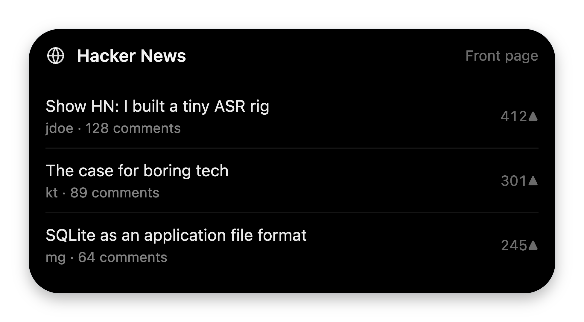
Rows carry a subtitle and a trailing value — enough to scan, never enough to read.
The metric card — header + stats + one chart
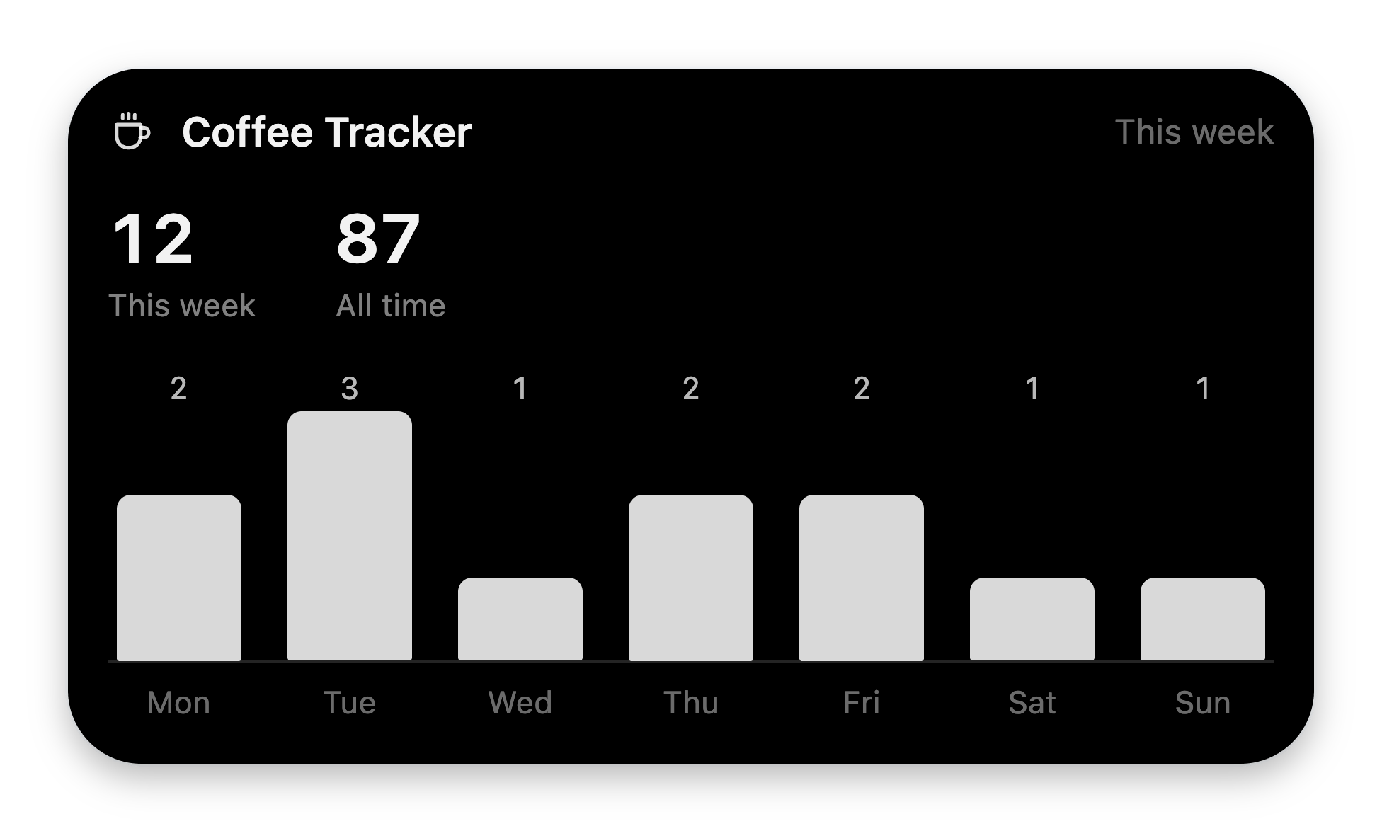
The full three-block budget: identity, the numbers, the shape of the numbers.
The status glance — a row
Puts a ring beside its caption.
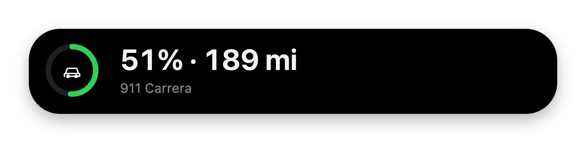
One block, two things side by side — the smallest card worth showing.
The composition — splitBar
What something is made of.
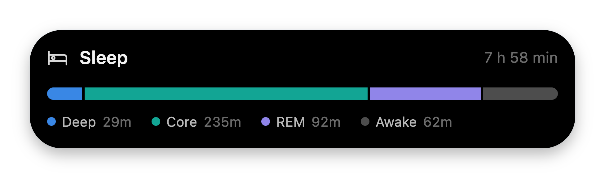
Segment colors are assigned by index, never by you — so composition can't read as good or bad.
Tones, glyphs, and app icons
toneis a meaning, not a color.good,bad, orneutral— the renderer owns the hues. You never pick colors; that’s how every card stays on-brand.- Glyphs come from a fixed allowlist of 34 names (
calendar,clock,mail,globe,coffee,sparkle, …) — see the full list. Unknown names invalidate the block. appIconrenders a real app logo (e.g."notion") in headers and list rows, and wins overicon. It only renders when the row’s visible title starts with that app’s name — so one brand can never masquerade as another.- Numbers are strings you format.
stats.valuecaps at 20 chars — send"5 hr 56 min", not21360. Deltas color by sign: leading-is red,+is green.
How cards behave
- Blocks animate in with the notch’s staggered blur-in; charts rise and wipe.
All motion respects
prefers-reduced-motion. clockandcountdowntick once per second. Preferuntil(an ISO timestamp) overseconds— an absolute target survives re-renders.- Cards render in the notch’s answer column and scroll internally if the viewport is tight. On small screens, less is more.
- One failing block never sinks the card — every block renders inside its own error boundary.
Next: Confirmation cards
Tools that act need approval first — declare the card the user approves on.