> ## Documentation Index
> Fetch the complete documentation index at: https://docs.voiceos.com/llms.txt
> Use this file to discover all available pages before exploring further.
# Result cards
> Attach a native glance card to any tool result — the easy way to look great in the notch.
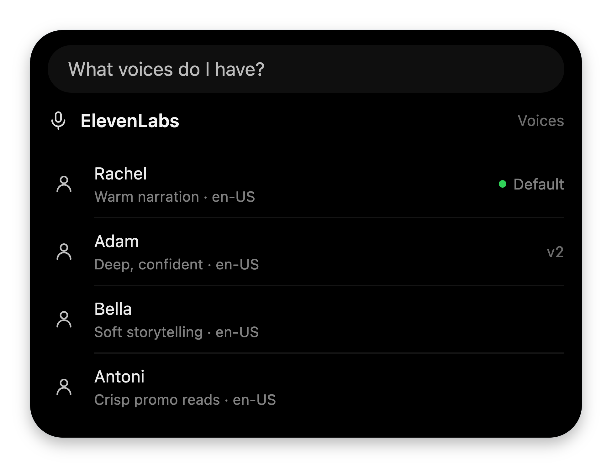
When your tool returns, the model narrates the data. A **glance card** is the
visual half of that answer: native blocks — headers, lists, stats, charts —
rendered by VoiceOS's own components. It's the same block language the VoiceOS
agent itself answers with, so your card is automatically on-brand, dark-glass
themed, and restyle-proof.
 ## Attaching a card
Spread `glanceResult([...])` into your tool's JSON result:
```ts theme={null}
return {
content: [
{
type: "text",
text: JSON.stringify({
stories, // what the model reads
...glanceResult([ // what the user sees
{ type: "header", title: "Hacker News", icon: "globe" },
{
type: "list",
rows: stories.map((s) => ({ title: s.title, trailing: `${s.score}▲` })),
},
]),
}),
},
],
};
```
That adds a `_voiceos_glance: { blocks }` key to your payload. VoiceOS lifts it
out **before the model sees the result** — the model reads your data, never your
UI JSON.
**Never put information only in the card.** The model narrates from the JSON
data. A card-only fact is a fact the agent can't say out loud.
## The budget
| Limit | Rule |
| ----------------- | ----------------------------------------------------------------------------------------------------------------------------------- |
| Blocks per card | **1–3.** `glanceResult` throws outside that range. |
| Charts per card | **1** (`bars`, `line`, or `splitBar`). Extras are dropped at render time. |
| String lengths | Per-field caps (titles ≤ 60 chars, list subtitles ≤ 72, …). **Pre-trim your strings** — over-cap blocks are dropped, not truncated. |
| Off-schema blocks | Silently dropped, never rendered broken. |
Your folder's `bun verify.ts` catches shape mistakes before users do.
## The vocabulary
| Block | Use it for |
| ----------- | -------------------------------------------------------------------------------------- |
| `header` | Who's talking: icon or app logo + title + a trailing detail. Usually your first block. |
| `list` | Up to 6 rows — title, subtitle, trailing text or a status badge, optional icons. |
| `stats` | 1–3 big numbers with labels, optional deltas (`+3%`) and tones. |
| `keyValue` | Up to 5 label/value pairs — flight details, order fields, settings. |
| `bars` | 2–7 labeled bars. Every bar carries its value. |
| `line` | A 2–60 point trend with optional baseline and start/end labels. |
| `splitBar` | One bar split into 2–4 composition segments with a legend. |
| `progress` | A bar or ring toward a goal (`value`, `max` — **`max` defaults to 100**). |
| `clock` | A live analog or digital clock, any IANA timezone. |
| `countdown` | A live countdown to an ISO time (`until`) or from `seconds` (≤ 30 days). |
| `badges` | 1–3 quiet status chips. |
| `divider` | A hairline rule. |
| `row` | Lay 2–3 leaf blocks side by side (e.g. ring + stats). Rows never nest. |
| `widget` | Your own sandboxed HTML — see [Custom widgets](/integrations/widgets). |
Every prop, cap, and edge case:
[glance block reference](/integrations/reference/glance-blocks).
## Four patterns that work
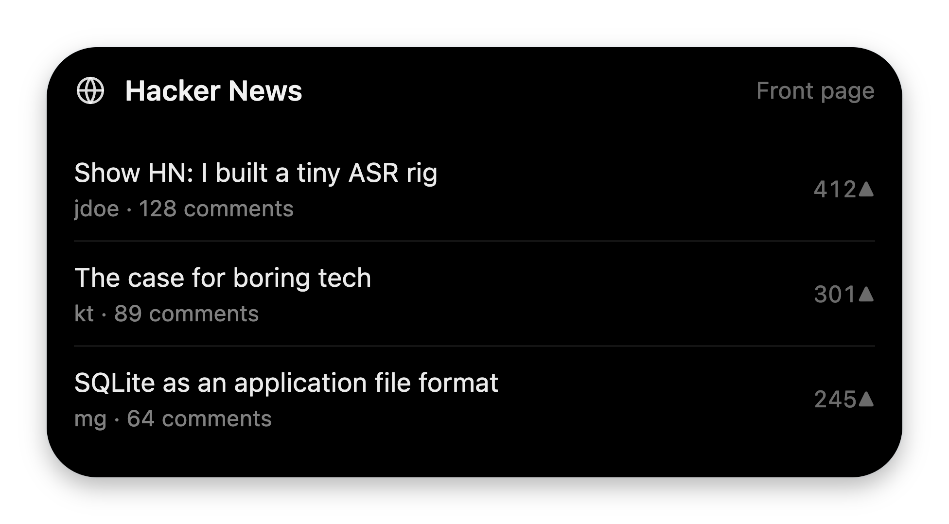
### The lookup — header + list
The bread and butter.
```json theme={null}
[
{ "type": "header", "icon": "globe", "title": "Hacker News", "trailing": "Front page" },
{ "type": "list", "rows": [
{ "title": "Show HN: I built a tiny ASR rig", "subtitle": "jdoe · 128 comments", "trailing": "412▲" },
{ "title": "The case for boring tech", "subtitle": "kt · 89 comments", "trailing": "301▲" },
{ "title": "SQLite as an application file format", "subtitle": "mg · 64 comments", "trailing": "245▲" }
] }
]
```
## Attaching a card
Spread `glanceResult([...])` into your tool's JSON result:
```ts theme={null}
return {
content: [
{
type: "text",
text: JSON.stringify({
stories, // what the model reads
...glanceResult([ // what the user sees
{ type: "header", title: "Hacker News", icon: "globe" },
{
type: "list",
rows: stories.map((s) => ({ title: s.title, trailing: `${s.score}▲` })),
},
]),
}),
},
],
};
```
That adds a `_voiceos_glance: { blocks }` key to your payload. VoiceOS lifts it
out **before the model sees the result** — the model reads your data, never your
UI JSON.
**Never put information only in the card.** The model narrates from the JSON
data. A card-only fact is a fact the agent can't say out loud.
## The budget
| Limit | Rule |
| ----------------- | ----------------------------------------------------------------------------------------------------------------------------------- |
| Blocks per card | **1–3.** `glanceResult` throws outside that range. |
| Charts per card | **1** (`bars`, `line`, or `splitBar`). Extras are dropped at render time. |
| String lengths | Per-field caps (titles ≤ 60 chars, list subtitles ≤ 72, …). **Pre-trim your strings** — over-cap blocks are dropped, not truncated. |
| Off-schema blocks | Silently dropped, never rendered broken. |
Your folder's `bun verify.ts` catches shape mistakes before users do.
## The vocabulary
| Block | Use it for |
| ----------- | -------------------------------------------------------------------------------------- |
| `header` | Who's talking: icon or app logo + title + a trailing detail. Usually your first block. |
| `list` | Up to 6 rows — title, subtitle, trailing text or a status badge, optional icons. |
| `stats` | 1–3 big numbers with labels, optional deltas (`+3%`) and tones. |
| `keyValue` | Up to 5 label/value pairs — flight details, order fields, settings. |
| `bars` | 2–7 labeled bars. Every bar carries its value. |
| `line` | A 2–60 point trend with optional baseline and start/end labels. |
| `splitBar` | One bar split into 2–4 composition segments with a legend. |
| `progress` | A bar or ring toward a goal (`value`, `max` — **`max` defaults to 100**). |
| `clock` | A live analog or digital clock, any IANA timezone. |
| `countdown` | A live countdown to an ISO time (`until`) or from `seconds` (≤ 30 days). |
| `badges` | 1–3 quiet status chips. |
| `divider` | A hairline rule. |
| `row` | Lay 2–3 leaf blocks side by side (e.g. ring + stats). Rows never nest. |
| `widget` | Your own sandboxed HTML — see [Custom widgets](/integrations/widgets). |
Every prop, cap, and edge case:
[glance block reference](/integrations/reference/glance-blocks).
## Four patterns that work
### The lookup — header + list
The bread and butter.
```json theme={null}
[
{ "type": "header", "icon": "globe", "title": "Hacker News", "trailing": "Front page" },
{ "type": "list", "rows": [
{ "title": "Show HN: I built a tiny ASR rig", "subtitle": "jdoe · 128 comments", "trailing": "412▲" },
{ "title": "The case for boring tech", "subtitle": "kt · 89 comments", "trailing": "301▲" },
{ "title": "SQLite as an application file format", "subtitle": "mg · 64 comments", "trailing": "245▲" }
] }
]
```
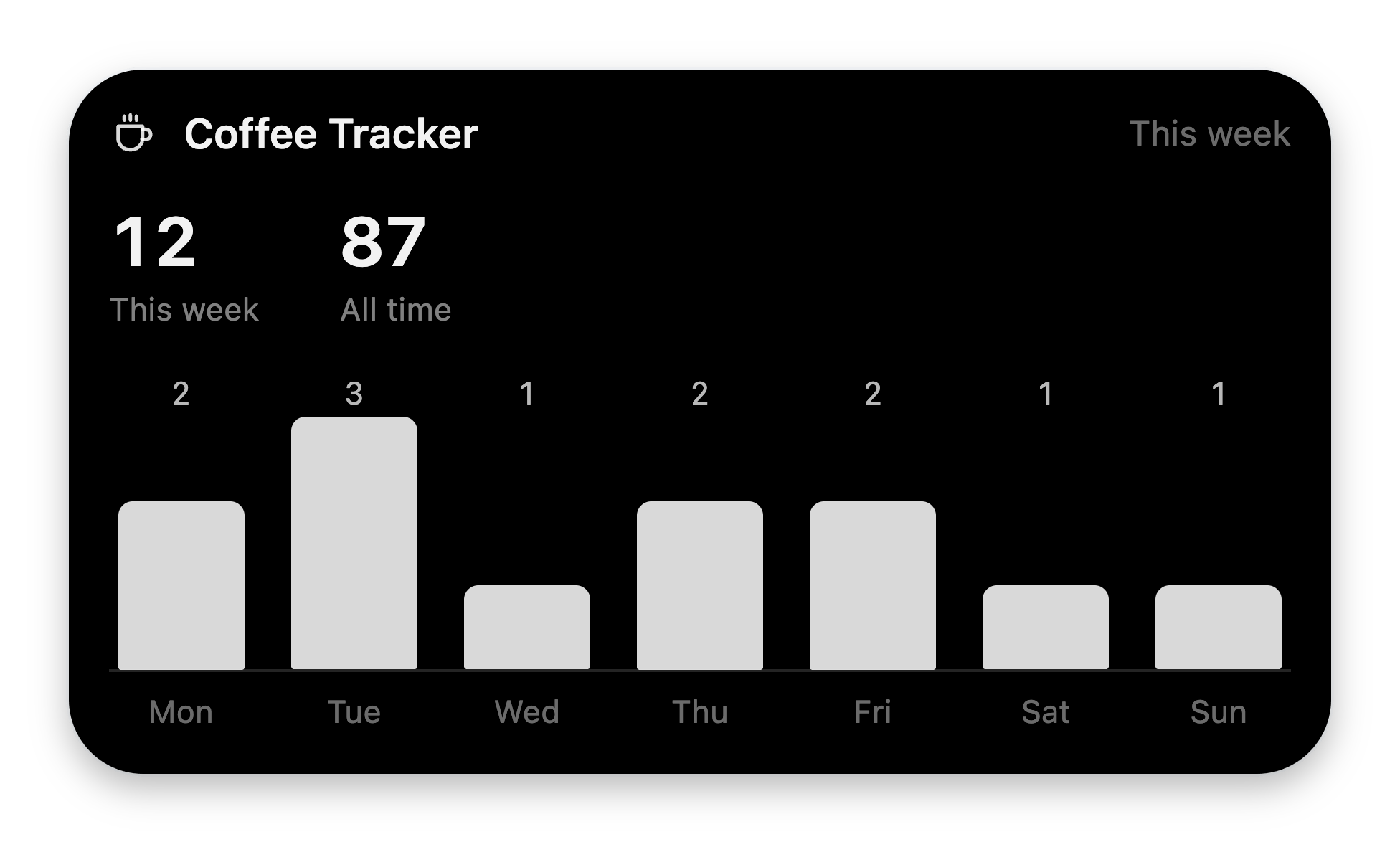
 ### The metric card — header + stats + one chart
```json theme={null}
[
{ "type": "header", "icon": "coffee", "title": "Coffee Tracker", "trailing": "This week" },
{ "type": "stats", "items": [
{ "label": "This week", "value": "12" },
{ "label": "All time", "value": "87" }
] },
{ "type": "bars", "labels": ["Mon","Tue","Wed","Thu","Fri","Sat","Sun"], "values": [2,3,1,2,2,1,1] }
]
```
### The metric card — header + stats + one chart
```json theme={null}
[
{ "type": "header", "icon": "coffee", "title": "Coffee Tracker", "trailing": "This week" },
{ "type": "stats", "items": [
{ "label": "This week", "value": "12" },
{ "label": "All time", "value": "87" }
] },
{ "type": "bars", "labels": ["Mon","Tue","Wed","Thu","Fri","Sat","Sun"], "values": [2,3,1,2,2,1,1] }
]
```
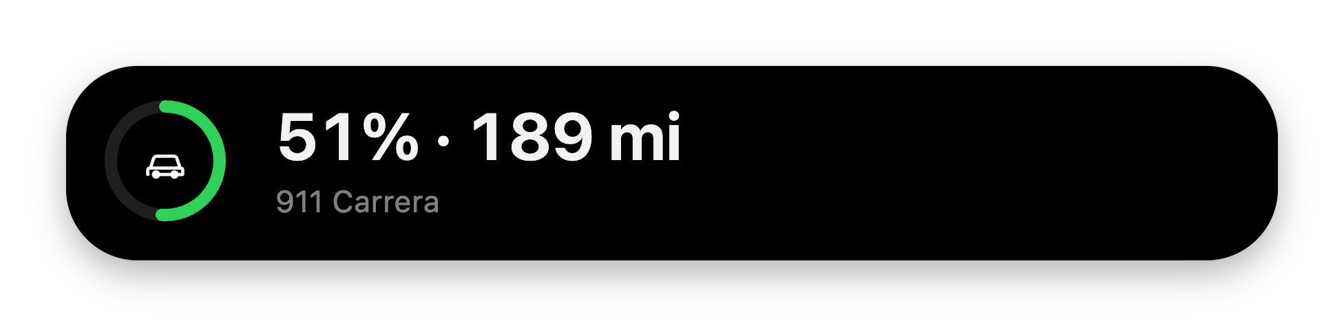
 ### The status glance — a `row`
Puts a ring beside its caption.
```json theme={null}
[
{ "type": "row", "children": [
{ "type": "progress", "style": "ring", "value": 51, "icon": "car", "tone": "good" },
{ "type": "stats", "items": [{ "label": "911 Carrera", "value": "51% · 189 mi" }] }
] }
]
```
### The status glance — a `row`
Puts a ring beside its caption.
```json theme={null}
[
{ "type": "row", "children": [
{ "type": "progress", "style": "ring", "value": 51, "icon": "car", "tone": "good" },
{ "type": "stats", "items": [{ "label": "911 Carrera", "value": "51% · 189 mi" }] }
] }
]
```
 ### The composition — `splitBar`
What something is made of.
```json theme={null}
[
{ "type": "header", "icon": "bed", "title": "Sleep", "trailing": "7 h 58 min" },
{ "type": "splitBar", "unit": "m", "segments": [["Deep", 29], ["Core", 235], ["REM", 92], ["Awake", 62]] }
]
```
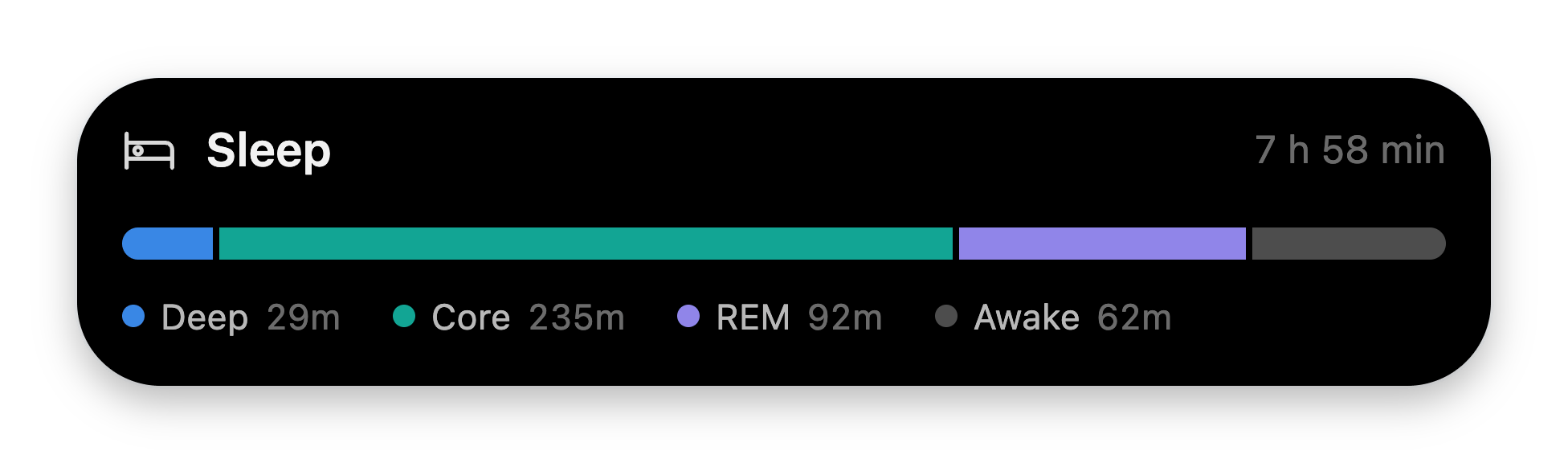
### The composition — `splitBar`
What something is made of.
```json theme={null}
[
{ "type": "header", "icon": "bed", "title": "Sleep", "trailing": "7 h 58 min" },
{ "type": "splitBar", "unit": "m", "segments": [["Deep", 29], ["Core", 235], ["REM", 92], ["Awake", 62]] }
]
```
 ## Tones, glyphs, and app icons
* **`tone` is a meaning, not a color.** `good`, `bad`, or `neutral` — the
renderer owns the hues. You never pick colors; that's how every card stays
on-brand.
* **Glyphs** come from a fixed allowlist of 34 names (`calendar`, `clock`,
`mail`, `globe`, `coffee`, `sparkle`, …) — see the
[full list](/integrations/reference/glance-blocks#glyphs). Unknown names
invalidate the block.
* **`appIcon`** renders a real app logo (e.g. `"notion"`) in headers and list
rows, and wins over `icon`. It only renders when the row's visible title
starts with that app's name — so one brand can never masquerade as another.
* **Numbers are strings you format.** `stats.value` caps at 20 chars — send
`"5 hr 56 min"`, not `21360`. Deltas color by sign: leading `-` is red, `+` is
green.
## How cards behave
* Blocks animate in with the notch's staggered blur-in; charts rise and wipe.
All motion respects `prefers-reduced-motion`.
* `clock` and `countdown` tick once per second. Prefer `until` (an ISO
timestamp) over `seconds` — an absolute target survives re-renders.
* Cards render in the notch's answer column and scroll internally if the
viewport is tight. On small screens, less is more.
* One failing block never sinks the card — every block renders inside its own
error boundary.
Tools that act need approval first — declare the card the user approves on.
## Tones, glyphs, and app icons
* **`tone` is a meaning, not a color.** `good`, `bad`, or `neutral` — the
renderer owns the hues. You never pick colors; that's how every card stays
on-brand.
* **Glyphs** come from a fixed allowlist of 34 names (`calendar`, `clock`,
`mail`, `globe`, `coffee`, `sparkle`, …) — see the
[full list](/integrations/reference/glance-blocks#glyphs). Unknown names
invalidate the block.
* **`appIcon`** renders a real app logo (e.g. `"notion"`) in headers and list
rows, and wins over `icon`. It only renders when the row's visible title
starts with that app's name — so one brand can never masquerade as another.
* **Numbers are strings you format.** `stats.value` caps at 20 chars — send
`"5 hr 56 min"`, not `21360`. Deltas color by sign: leading `-` is red, `+` is
green.
## How cards behave
* Blocks animate in with the notch's staggered blur-in; charts rise and wipe.
All motion respects `prefers-reduced-motion`.
* `clock` and `countdown` tick once per second. Prefer `until` (an ISO
timestamp) over `seconds` — an absolute target survives re-renders.
* Cards render in the notch's answer column and scroll internally if the
viewport is tight. On small screens, less is more.
* One failing block never sinks the card — every block renders inside its own
error boundary.
Tools that act need approval first — declare the card the user approves on.