> ## Documentation Index
> Fetch the complete documentation index at: https://docs.voiceos.com/llms.txt
> Use this file to discover all available pages before exploring further.
# Confirmation cards
> Anything that acts gets approved first — declare the card the user approves on.
Acting tools must declare a `confirmation` view in the manifest: a card the
notch renders *before any of your code runs*. The user reviews it, edits the
arguments inline, and approves. The edited values are what execute.
The rule cuts both ways:
| | |
| --------------------------------- | ---------------------------------------------------------------------------------------- |
| **Acting tools must declare one** | Anything that sends, creates, deletes, updates, posts, books, pays, publishes, or opens. |
| **Read-only tools must not** | Get, list, search, fetch, check. Nagging on reads makes the whole assistant feel broken. |
Instantly reversible media-transport verbs — play, pause, skip — count as
reads.
Because the card renders before your code runs, it's **data, not code**: a
declarative block tree in the manifest. No integration code can spoof a system
confirmation or approve itself.
## Anatomy
An ElevenLabs `generate_speech` tool would declare:
```json theme={null}
"confirmation": {
"schemaVersion": 1,
"root": {
"type": "card",
"title": "Generate speech",
"children": [
{ "type": "textField", "bind": "{{text}}", "label": "Text", "multiline": true, "required": true },
{
"type": "select",
"bind": "{{voice}}",
"label": "Voice",
"options": [
{ "label": "Rachel", "value": "rachel" },
{ "label": "Adam", "value": "adam" },
{ "label": "Bella", "value": "bella" }
]
}
],
"footer": [
{
"type": "actions",
"items": [
{ "label": "Cancel", "role": "cancel" },
{ "label": "Generate", "role": "confirm", "color": "accent" }
]
}
]
}
}
```
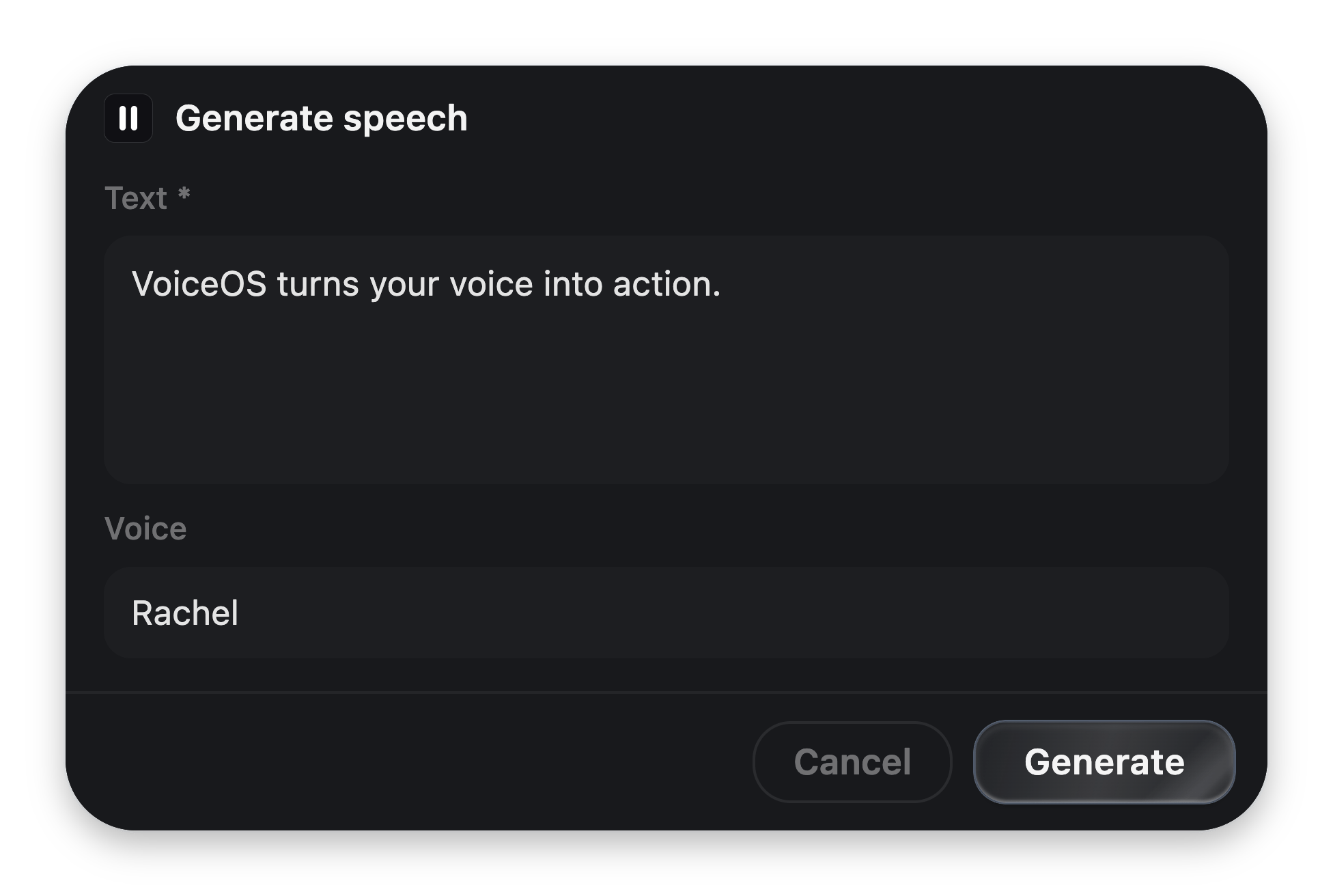 A view is `{ schemaVersion: 1, root: }` — one root block, usually a
`card` with `children` and a `footer`.
## Bindings
A binding is `{{arg}}`. It connects the card to the tool call's arguments:
| Where | Effect |
| --------------------- | ------------------------------------------------------------------------------------------------------------------------------------------------ |
| **In display text** | Interpolates the argument into the string: `{ "type": "text", "text": "Open {{title}}?" }` |
| **On an input block** | `bind: "{{url}}"` shows the argument's current value and stages the user's edit. On approval, edited values **replace** what the agent proposed. |
| **Dotted paths** | `{{user.name}}` reads and writes back into nested arguments. |
Every bound name must exist in the tool's `inputSchema` properties — validation
enforces it.
## The vocabulary
| Kind | Blocks |
| ------------------------------------------------- | --------------------------------------------------------------------------------------------------------------------------------- |
| **Display** | `text`, `markdown` (sanitized, no raw HTML), `keyValue`, `metadata`, `list` / `listItem`, `image`, `badge`, `progress`, `divider` |
| **Layout** | `card`, `stack` |
| **Input** (all take `bind`, `label`, `required?`) | `textField`, `passwordField`, `select` (needs `options`), `toggle`, `chips` |
| **Action** | `button`, and `actions` with roles `confirm`, `cancel`, `copy`, `openUrl` |
Full prop tables: [UI block reference](/integrations/reference/ui-blocks).
## Rules the renderer enforces
* **One `confirm` and one `cancel`** in the footer. The first `confirm` renders
as the primary glass pill; the rest render as quiet ghost buttons.
* **`required` gates the confirm button** until every required, *visible* input
holds a non-whitespace value. The marker is a quiet `*`, permanent by design,
so an untouched form never looks like it failed validation.
* **Toggles never gate** — off is an answer.
* **Cancel is never gated**, and neither are `copy` / `openUrl`.
* **`visibleIf`** (on every block) shows a subtree only while the bound value is
truthy. Hidden required fields don't gate.
* **Name the consequence** on destructive actions: *"Delete 42 files"*, not
*"Confirm"*.
## What the user can do
Approval isn't only a click:
| | |
| ------------------- | ------------------------------------------------------------------------------------------------------------------------ |
| **Approve** | Click the confirm action, or just say yes. |
| **Decline** | Say "no" or dismiss the card. Your tool never runs. |
| **Revise by voice** | *"Make it shorter and send it to Sam instead"* re-engages the agent, which supersedes the card with an updated proposal. |
| **Edit inline** | Change any bound field before approving. |
| **Walk away** | The card parks in the background and can be restored from the side notch. |
Design for that: bind the arguments a user would plausibly want to correct, and
show — don't hide — everything the tool is about to do.
## Users can turn confirmations off
Your manifest decides the *default*. On the integration's detail page (and in
the Studio), each action has an **Asks first** toggle — a user who trusts your
integration can let an action run the moment the agent picks it.
Don't fight this. Keep confirmations meaningful and users keep them on.
## Reserved for the future
Two shapes are declared in the contract but rejected by validation in
`schemaVersion: 1` — don't ship them yet:
* `role: "custom"` buttons and actions (server round-trip actions).
* `canvas` blocks (an MCP-Apps-style embedded iframe resource).
A confirmation view can be a single sandboxed HTML widget — your pixels,
VoiceOS's floating confirm button.
A view is `{ schemaVersion: 1, root: }` — one root block, usually a
`card` with `children` and a `footer`.
## Bindings
A binding is `{{arg}}`. It connects the card to the tool call's arguments:
| Where | Effect |
| --------------------- | ------------------------------------------------------------------------------------------------------------------------------------------------ |
| **In display text** | Interpolates the argument into the string: `{ "type": "text", "text": "Open {{title}}?" }` |
| **On an input block** | `bind: "{{url}}"` shows the argument's current value and stages the user's edit. On approval, edited values **replace** what the agent proposed. |
| **Dotted paths** | `{{user.name}}` reads and writes back into nested arguments. |
Every bound name must exist in the tool's `inputSchema` properties — validation
enforces it.
## The vocabulary
| Kind | Blocks |
| ------------------------------------------------- | --------------------------------------------------------------------------------------------------------------------------------- |
| **Display** | `text`, `markdown` (sanitized, no raw HTML), `keyValue`, `metadata`, `list` / `listItem`, `image`, `badge`, `progress`, `divider` |
| **Layout** | `card`, `stack` |
| **Input** (all take `bind`, `label`, `required?`) | `textField`, `passwordField`, `select` (needs `options`), `toggle`, `chips` |
| **Action** | `button`, and `actions` with roles `confirm`, `cancel`, `copy`, `openUrl` |
Full prop tables: [UI block reference](/integrations/reference/ui-blocks).
## Rules the renderer enforces
* **One `confirm` and one `cancel`** in the footer. The first `confirm` renders
as the primary glass pill; the rest render as quiet ghost buttons.
* **`required` gates the confirm button** until every required, *visible* input
holds a non-whitespace value. The marker is a quiet `*`, permanent by design,
so an untouched form never looks like it failed validation.
* **Toggles never gate** — off is an answer.
* **Cancel is never gated**, and neither are `copy` / `openUrl`.
* **`visibleIf`** (on every block) shows a subtree only while the bound value is
truthy. Hidden required fields don't gate.
* **Name the consequence** on destructive actions: *"Delete 42 files"*, not
*"Confirm"*.
## What the user can do
Approval isn't only a click:
| | |
| ------------------- | ------------------------------------------------------------------------------------------------------------------------ |
| **Approve** | Click the confirm action, or just say yes. |
| **Decline** | Say "no" or dismiss the card. Your tool never runs. |
| **Revise by voice** | *"Make it shorter and send it to Sam instead"* re-engages the agent, which supersedes the card with an updated proposal. |
| **Edit inline** | Change any bound field before approving. |
| **Walk away** | The card parks in the background and can be restored from the side notch. |
Design for that: bind the arguments a user would plausibly want to correct, and
show — don't hide — everything the tool is about to do.
## Users can turn confirmations off
Your manifest decides the *default*. On the integration's detail page (and in
the Studio), each action has an **Asks first** toggle — a user who trusts your
integration can let an action run the moment the agent picks it.
Don't fight this. Keep confirmations meaningful and users keep them on.
## Reserved for the future
Two shapes are declared in the contract but rejected by validation in
`schemaVersion: 1` — don't ship them yet:
* `role: "custom"` buttons and actions (server round-trip actions).
* `canvas` blocks (an MCP-Apps-style embedded iframe resource).
A confirmation view can be a single sandboxed HTML widget — your pixels,
VoiceOS's floating confirm button.